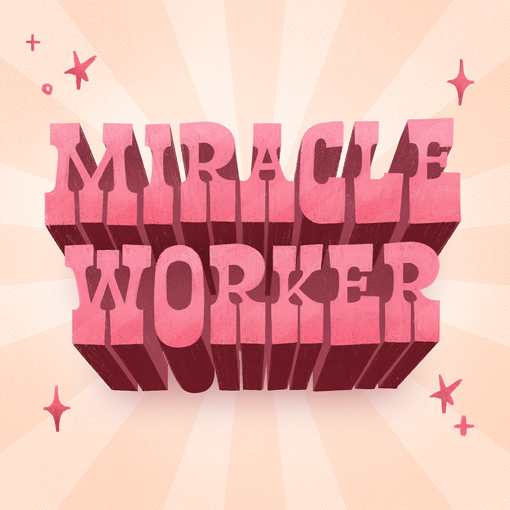
Miracle Worker
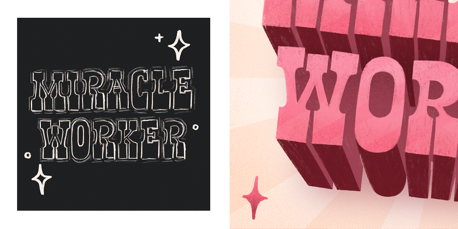
I wanted to work on 3D lettering for once. “Miracle Worker” suddenly popped into my head and I ran with it. I’ve used this style before but never as something 3D. It was a bit of a challenge determining the angle of the shadow and its shading but we eventually got there.
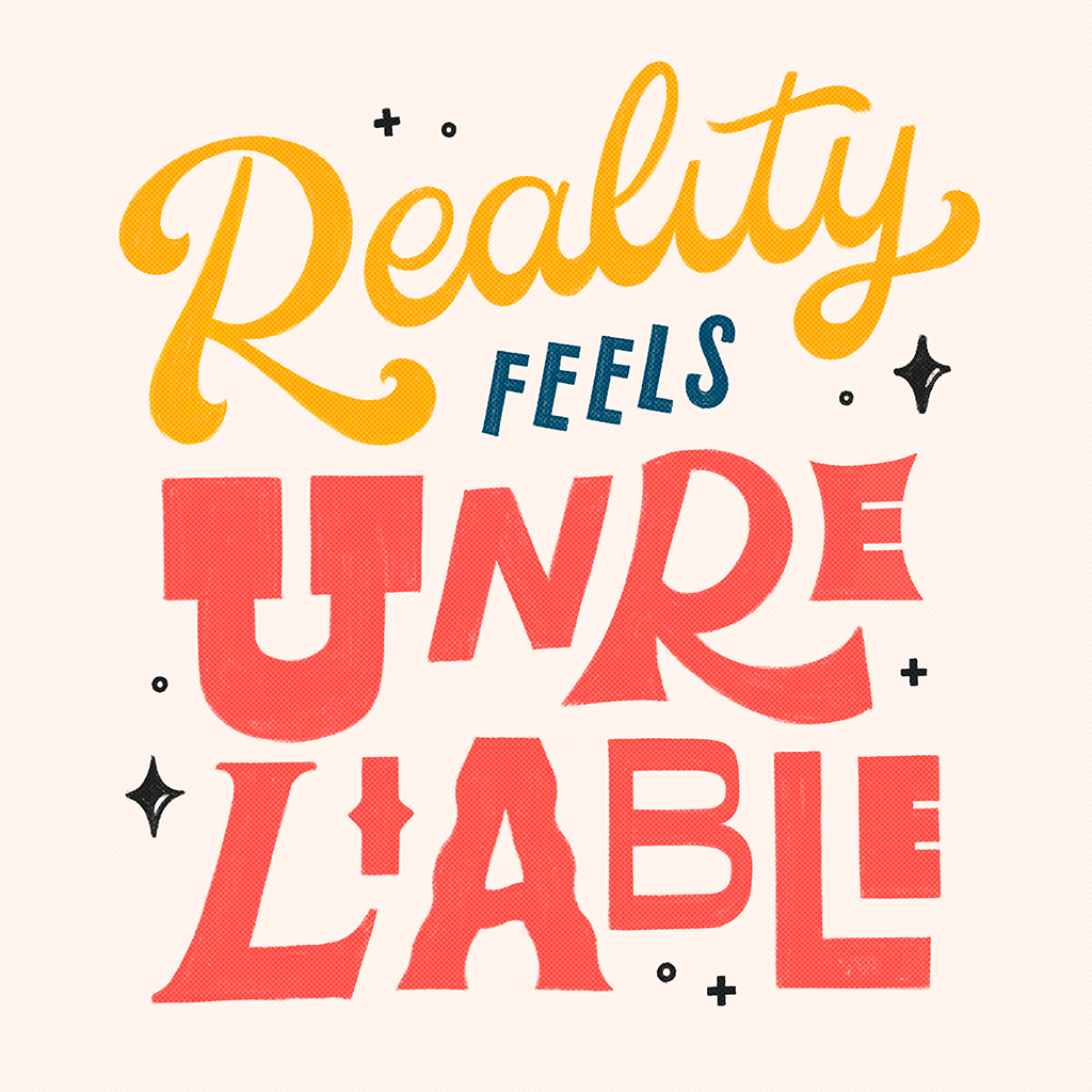
Reality is Unreliable
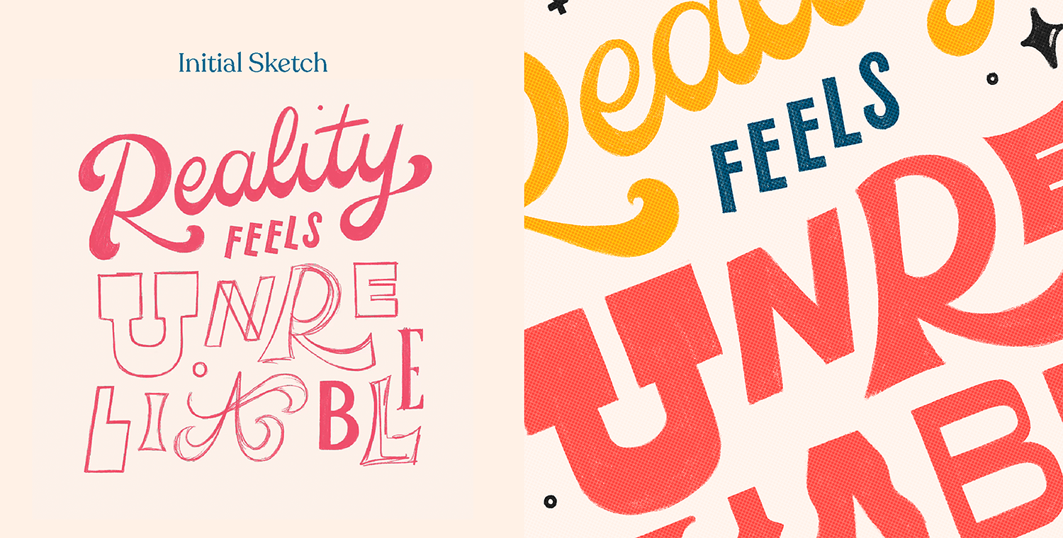
Fueled by a year in quarantine, this piece very directly questions the reliability of time and space and reality and everything in between. Can someone please tell me how it’s already 2021? From a creative perspective, I wanted to see how many styles I can fit while maintaining cohesiveness. This was inspired by the title treatment of Marvel Studios’ Loki (2021). Link to post here.
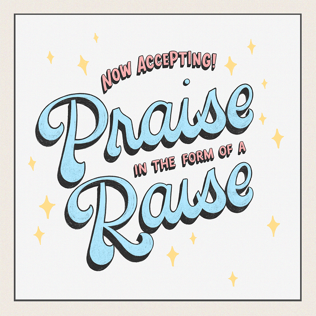
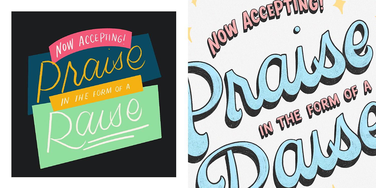
Praise for a Raise
This phrase comes from Lauren Hom’s WTF Should I Letter generator. I wanted to translate it using 3D-shadowed fat-bottomed lettering in pastel colors to match the phrase’s passive aggressiveness with a sickly sweet coat of style and color. Link to post here.
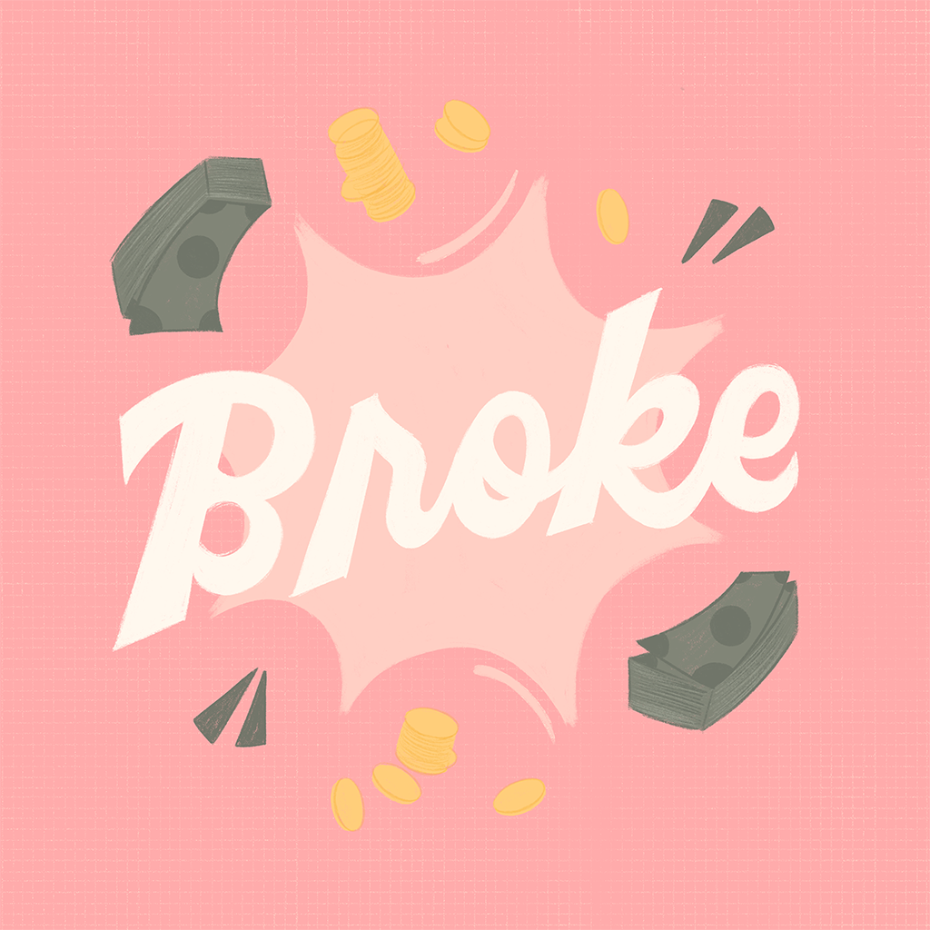
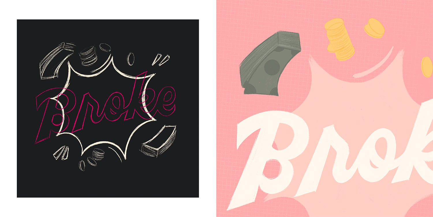
Broke
If you’re gonna be broke make sure it looks pretty. I began with wanting to use a sage and pink color combination. At the time, I was experimenting with style a bit and I lettered the word in a chunky script with pointed ends, then surrounded it with rough illustrations of money and added a background texture to match.
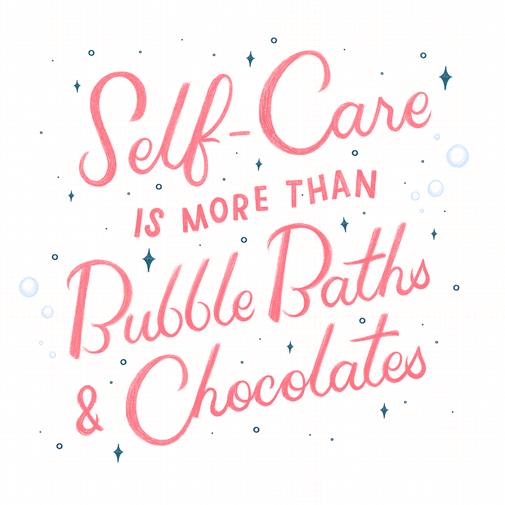
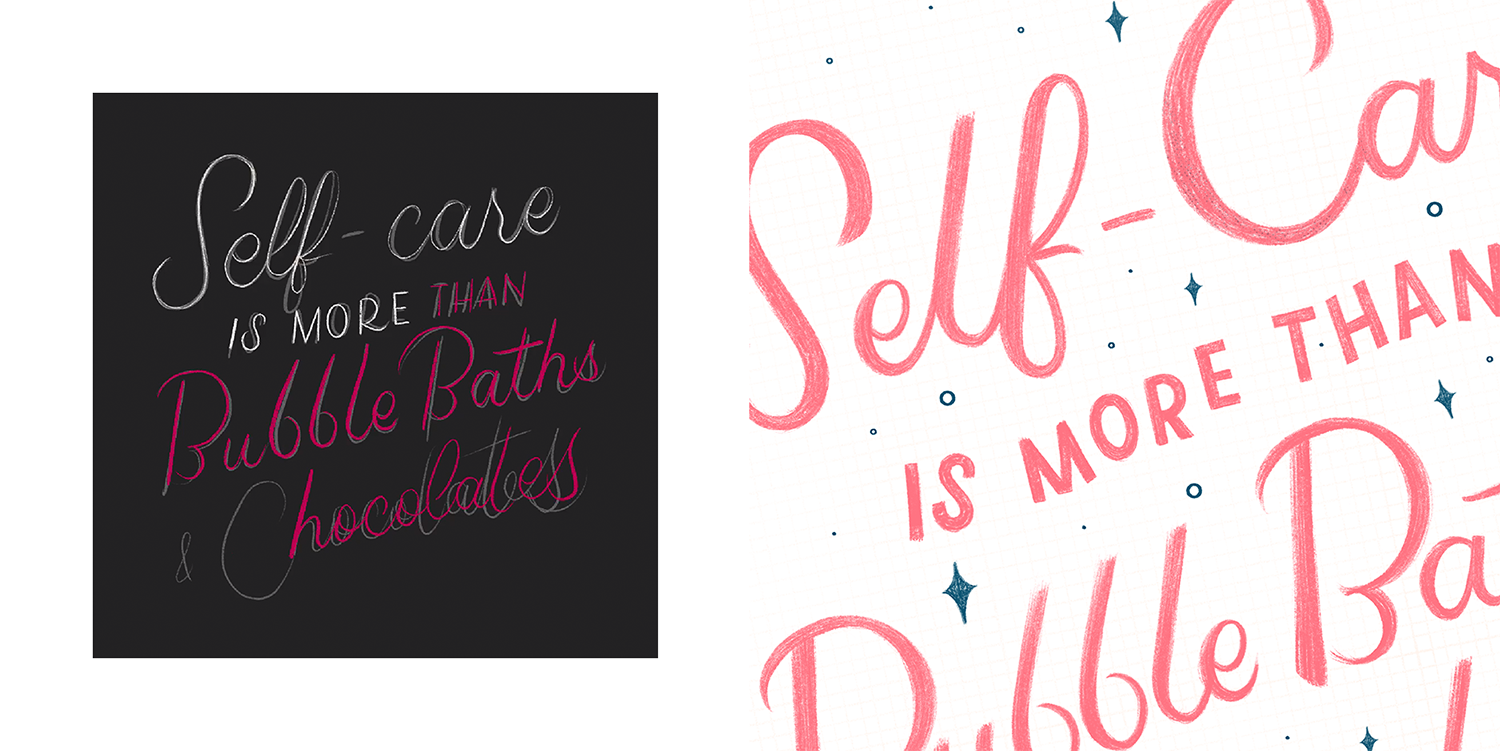
Self-care
I’ve been meaning to practice longer quotes and this had been on the back burner for a while. The quote is paraphrased from an article by Brianna Wiest. It’s done in a wispy style to represent the status of my mental health (I’m kidding). Link to post here.

